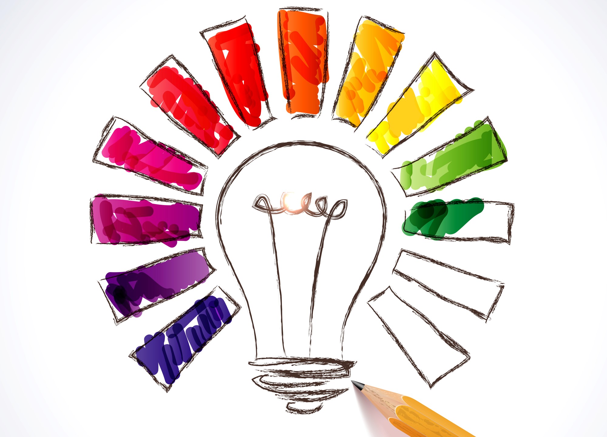
Using the Psychology of Colours for your Business Cards and Labels
This article is shared with permission from Virtual Print, a leading online printing service in Hamilton, New Zealand.
Marketing, design, graphics, printing… where do you start? What font should I use? What kind of paper? Does colour matter?
First, if you are designing new graphic content, we have designers on hand to help you. Feel free to contact us if you would like help.
Often going unnoticed, colour plays a strong role in forming an effective brand and building brand identity. Without proper research into what colour scheme fits best, a company may risk evoking ill-effective feelings with their target audience rendering any campaign a disaster. To ensure that a meaningful impact is made right from the get go, companies need to ensure that they are careful with their colour choice to avoid losing potential customers right from the start.
This article will give you all the knowledge you need in order to construct a meaningful brand identity that will attract your target audience. Before you look at rolling out a full rebrand or even a branding from scratch, you will need to carefully consider all alternatives from label printing, through to email outreach. All of which will incorporate your well selected colour scheme that will appeal to your customers.
Here are Some Interesting Facts About the Psychology of Colour
The psychology of colour has been a hot topic for marketeers for a long period of time – dating back to 1666 when sir Issac Newton first discovered that white light passing through a prism. So how much does colour really influence brands labels and marketing? Here is 7 interesting facts that may make you think twice before you approach your label printing supplier for your next rebrand:
-
- Colors can influence up to 90% of a person’s first impression.
- Colors are perceived differently by men and women based on their gender and culture.
- 35 percent of women and 57 percent of men prefer the colour blue.
- 85 percent of buyers’ purchase decisions are influenced by colour.
- Colors improve brand recognition by 80%.
- People’s behaviour, mood, and stress levels are all influenced by colour.
- When it comes to shopping, 93% of people are solely concerned with the looks of a product.
Basic Colours and Their Connotations

Source: www.parallelbranding.com
Below is an easy and basic guide that will help you to select a colour scheme for your brand. When thinking about these, try to imitate the basic feelings that you want to evoke with your target audience. Be sure to consider the negative connotations as much as you consider the positive.
Red
Speed, strength, power, heat, aggression, danger, fire, passionate, sincerity, happiness
Pink
Love and romance, tenderness, acceptance, and tranquility, feminine, youthful, and lightheartedness.
Beige
Pleasure, simplicity, calm, and pleasant
Yellow
Joy, happiness, betrayal, optimism, idealism, imagination, hope, sunshine, summer, gold, philosophy, dishonesty, cowardice, jealousy, covetousness, and deception
Navy
Integrity, expertise, power, and seriousness
Blue
Stability, harmony, unity, trust, truth, confidence, conservatism, security, cleanliness, order, loyalty, sky, water, technology, depression, and appetite suppressant
Purple
Royalty, nobility, spirituality, ceremony, mystery, transformation, wisdom, and enlightenment.
Orange
Vibrant, expansive, flamboyant, and demanding of attention, energy, balance, eagerness, and warmth
Green
Nature, good luck, rejuvenation, youth, spring, generosity, fertility, jealousy, service, inexperience, envy, misfortune, and vigour
Brown
Earth, stability, hearth, home, outdoors, dependability, comfort, endurance, simplicity, and relaxation
Gray
Security, intelligence, staidness, modesty, dignity, maturity, solidity, conservatism, practicality, and old age
White
Snow, good, sterility, marriage, simplicity, cleanliness, peace, humility, precision, innocence, youth, and winter
Black
Fear, evil, unhappiness, power, sexuality, sophistication, formality, and elegance
The Selection Process
With so many options of different colours we are easily spoilt for choice, so much that we really don’t know which one to choose. It is important that whatever you choose you keep it consistent from start to finish. This includes repetition over all marketing mediums, this is incredibly important to build brand loyalty and presence. Once you have narrowed down your selection to a few that you like, it’s time to look a little closer.
You can find out more about how to design the perfect product label here.
Brand Personality
Colors have a significant impact on purchasing behavior because of their impact on how a brand is represented; colour determines how shoppers perceive the business’s “personality.”

While certain colours are associated with particular traits, nearly every study on colours and branding will tell you that it’s far more important for color schemes to support the personality you want to project instead of conforming to stereotypical associations.
If you are able to connect the colour with your company’s persona you are likely to be halfway there. Positive energy that radiates through colour and is backed up by well conducted CSR can work wonders for public image and awareness.
Target Audience
To implement an effective colour scheme, you first need to understand your audience and what appeals to them. There are some obvious segmentations that you can make including country, age, and behavior.
Gender is often an overlooked component of deciding your target audience, especially when the intended audience could be either of the two. According to study on colour perception and preferences, men prefer bright colours to women’s gentler colours when it comes to shades, tints, and hues. Men are also more prone to choose shades of colours (colours with black added) as their preference, whereas women prefer tints of colours (colors with white added).
Typography, Imagery, and Research.
After you have managed to carefully segment and decipher your ideal target audience, it’s time to match your colour to the layout of your label. Label printing is often a case of finding the perfect aesthetic to suit ‘your type of people’.
Make sure that your writing and font style is a reflection of the colour scheme that you have chosen. You don’t want to appear tacky to potential buyers by incorporating vibrant colours into a design that’s very simple. In some cases this works, but this all depends on what you are marketing.
www.screamagency.com
Do your research. This phase cannot be overlooked as this will either make you look better or worse than your direct competitors. Studies have shown that consumers make up their minds about a person or product within 90 seconds. This is important but we need to understand the personalities of our targets. Successful labels and marketing are always defined by their initial impact.
Materials
The fourth and final stage of the colour selection process boils down to how good your colour will actually look when it is printed onto a material. Some materials, such as white polyester have a chrome like reflection compared to Litho which has a matte quality, either may be effective and it is up to you to decide which works best. Below are some of the most popular label printing materials:
Metalized polyester
Metalized polyester has a chrome surface, giving it a steel-like appearance. Both matte and glossy finishes are offered in clear and white polyester. Because of its dimensional consistency and ability to withstand extreme weather conditions, it is utilised both indoors and outdoors as pipe labels and control panel labels. It’s typically used to designate tools and air-conditioning systems.
Fluorescent and Foil Paper
Fluorescents can take the form of brilliantly coloured vinyl labels. It’s usually available in bright colours like red, green, pink, and orange. Because they alert people, they are widely applied for hazard labels. . A permanent adhesive is included with both fluorescent and foil kinds.
White Polypropylene
Polypropylene is a vinyl equivalent that is highly resistant to chemicals. Compared to polyester labels, it is also cheaper. It’s often transparent or white, with a gloss or matte appearance. It has a lot of flexibility and is very clear. The type of glue used is determined by the application.
Litho Paper
Litho paper is matte and unprotected. . In offices, direct thermal label printers are frequently used to print envelope labels on paper. It has both permanent and repositionable adhesive. Rubber base adhesives are included with semi-gloss and high-gloss paper. This is also employed in the food packaging industry.
Industrial Strength Vinyl
For outdoor labels, industrial vinyl is the prefered type of material. It is weather and chemical resistant. This material has the ability to stretch, allowing it to be used over rivets and sharp curved surfaces. Company fleet decals, hire equipment, and general outdoor use are the primary applications of the high strength and durable material.
Cling Vinyl
Static Cling Vinyl is a non-adhesive material that is commonly used for glass. It adheres to a surface through static electricity. It’s most commonly used on glass, metal, and other flat, level surfaces. Labels for (windshield) oil changes are a common application.
About Virtual Print
We are a New Zealand based printing company and offer our online printing services across New Zealand. At Virtual Print, we love helping businesses with their printing, signage and other aspects of branding. We print it all – from brochures, labels, posters, business cards, desk calendars, banners , booklets, book printing to specialty items.