Facebook has a tendency to make mountains out of molehills on little changes they make. But in this instance, they truly have revamped the power editor. Things aren’t just in different places – things work differently, the design differs and some brand new features were introduced.
As a whole, this is how the new power editor looks:

Now let’s break it down a bit and look at how it can work for you.
Navigation bar

The first change you will probably notice is the navigation bar. Before navigation items were hidden under drop downs. You would need to stab in the dark where your task would be before memorising locations. Talk about not being user friendly!
Now all items are clearly displayed at the top of the screen. No more guesswork involved. Here’s what you can use each item for:
Manage ads: This is exactly how it sounds.This allows you to manage campaigns, ad sets and the ads themselves.
Audiences: Here you can create custom audiences, lookalike audiences and access your saved target groups. A description of each of these actions is included in the picture below.

Image library: This is where all your saved images mingle together. This hasn’t been updated.
Reporting: You can find all your saved reports listed here. You can also schedule reports to be emailed to you directly.
Page posts: This is just “Manage pages” rebranded to describe more accurately this function. Nothing to see here.
Tools: This is more-or-less another name for “Miscellaneous” – Facebook has dumped all other tools under here. This includes Campaign Dashboard, Pixels, Billing, Account Settings and Account Groups.
Side navigation
Under “Manage Adverts” you will find these funnily little icons that look like this:

These icons represent three things:
- The campaign
- Ad sets
- Ad groups
They appear in this order on the side bar. When you click any of these tabs, the information will appear on the right.
Previously this used to appear as a list of campaigns, ad sets and ads on the left. However because of this change, it is even more important for you to use filtering according to Jon Loomer.
Lists get more legroom
One of the first things you might have noticed aesthetically is how wide and uncluttered this editor is. That is until you dive into lists. If you love opening lots of Windows tabs or sites like Trello, I can already tell you will love this editor update.
Previously there was a fiddly bar to adjust the editing pane at the top and the campaign list pane. Now the list takes up the main space. This gets a big tick for user friendliness in my books.
Editing made easy
Creating campaigns, ad sets or ads can easily be done using the power editor. Simply click “Create campaign” to create a campaign. If this isn’t what you’re after, click the little arrow to create an ad set or an ad.

So what if you made a mistake somewhere along the lines? Just click the pencil icon at the far right of a campaign. Once you’ve finished editing, just click the pencil icon again to make the editing pane disappear.
Filters for time poor ad men

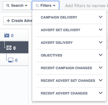
Let’s face it – ad men are busy. Too busy to sift through their hundreds of campaigns for dozens of clients. These filters allow you to easily find the right campaign through use of any of the 40 available filters.
The titles speak for themselves so all I can really say is go wild.
Once you have selected a filter, it will appear on the right. You can select or deselect your filter just by clicking on it.
