Ah home shows. Wandering through a strangers house, taking in all the sights and smells as your head fills with possibilities. Letting your senses take over as you gaze over the carefully decorated lounge and enjoy the scent of freshly baked bread – if you don’t get the reference, watch Countdown’s humorous TV ad here.
https://www.youtube.com/watch?v=30RDXSEXnt8
Of course, with home shows the magic is you’re only getting a delicious taster. You don’t see the giant carpet stain hidden under a carefully placed matt or the hole in the wall covered by a frame of a smiling family. What you see is only sometimes what you get.
In a way, your company website should be the same. This isn’t saying you should deceive your visitors – you should be honest. Although I wouldn’t recommend putting a less than promising review on your homepage. You should however, only display the best and brightest your company has to offer.
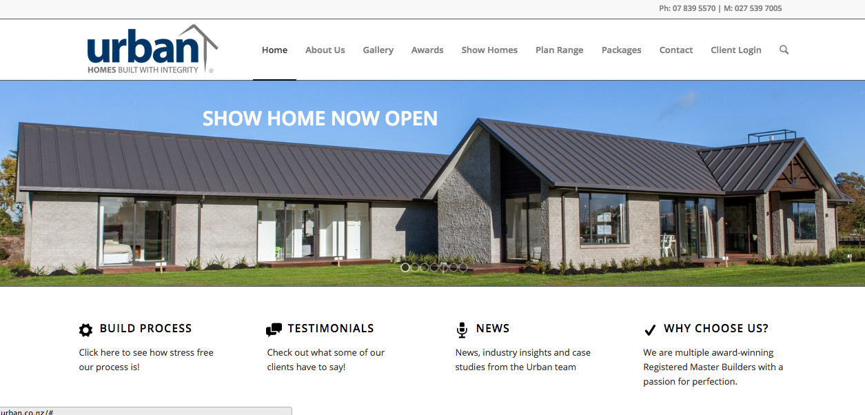
Take for example Urban Homes, master builders in Hamilton who are experts at building home shows and building a home show like website. If you haven’t already visited their website, here is the homepage:
 Stunning! See this is how a home show like website should appear. You don’t feel overwhelmed by huge chunks of information. Instead it appeals to your senses. Striking images, engaging transitions and small sound bites of information make a killer combo.
If you’re wanting to make your company website into a show home, follow Urban Homes example. Use strong visuals, sound bites of information and put your best foot forward.
